UK Diaries Identity Design
UK Diaries is a travel company that provides travel packages to travelers. They also arrange adventure activities like river rafting, trekking, bungee jumping, and more. They provide motorbikes, cars, and SUV to travelers.
GOALS:
Create a visual identity for the brand which is simple, clean, and communicate the idea of refreshment and youthfulness. Attract the attention of the targeted audience.
SOLUTION:
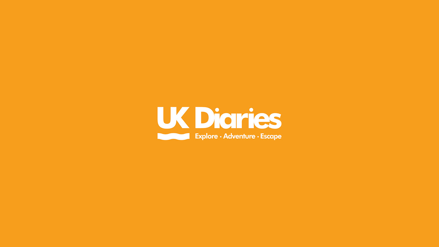
I made a new identity for the brand which is simple and clean. The logo is flexible and legible. It has a graphical element for visual interest and similar color and design of the old logo.
SCOPE OF WORK:
Brand Strategy
Identity Design
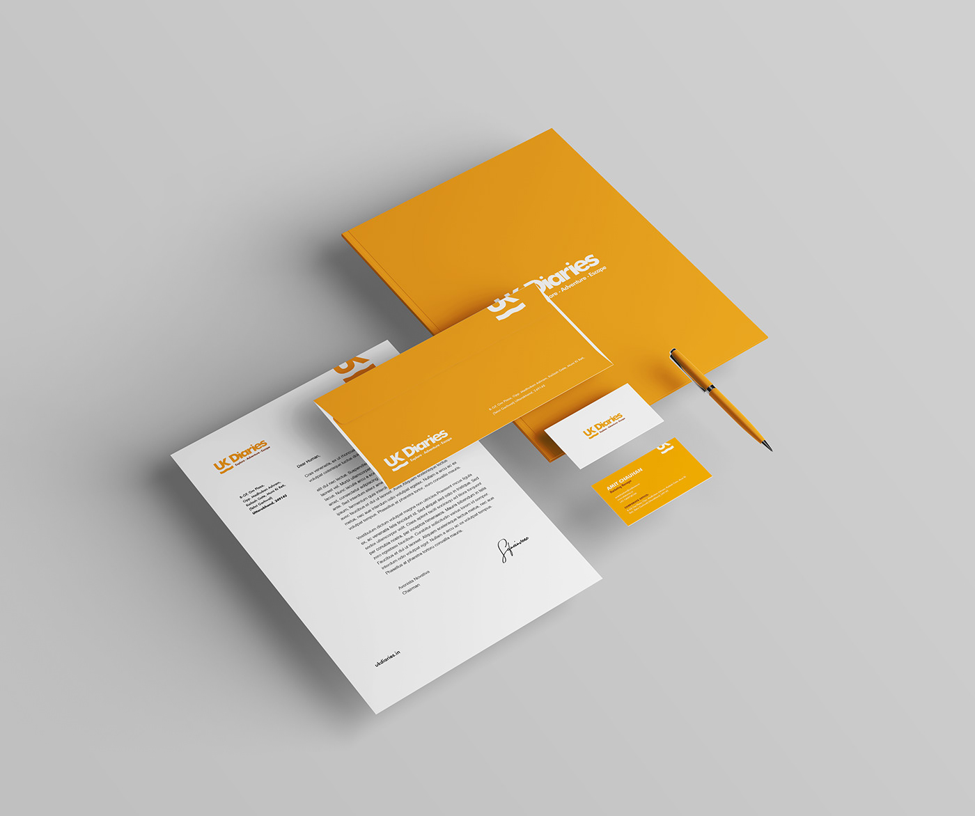
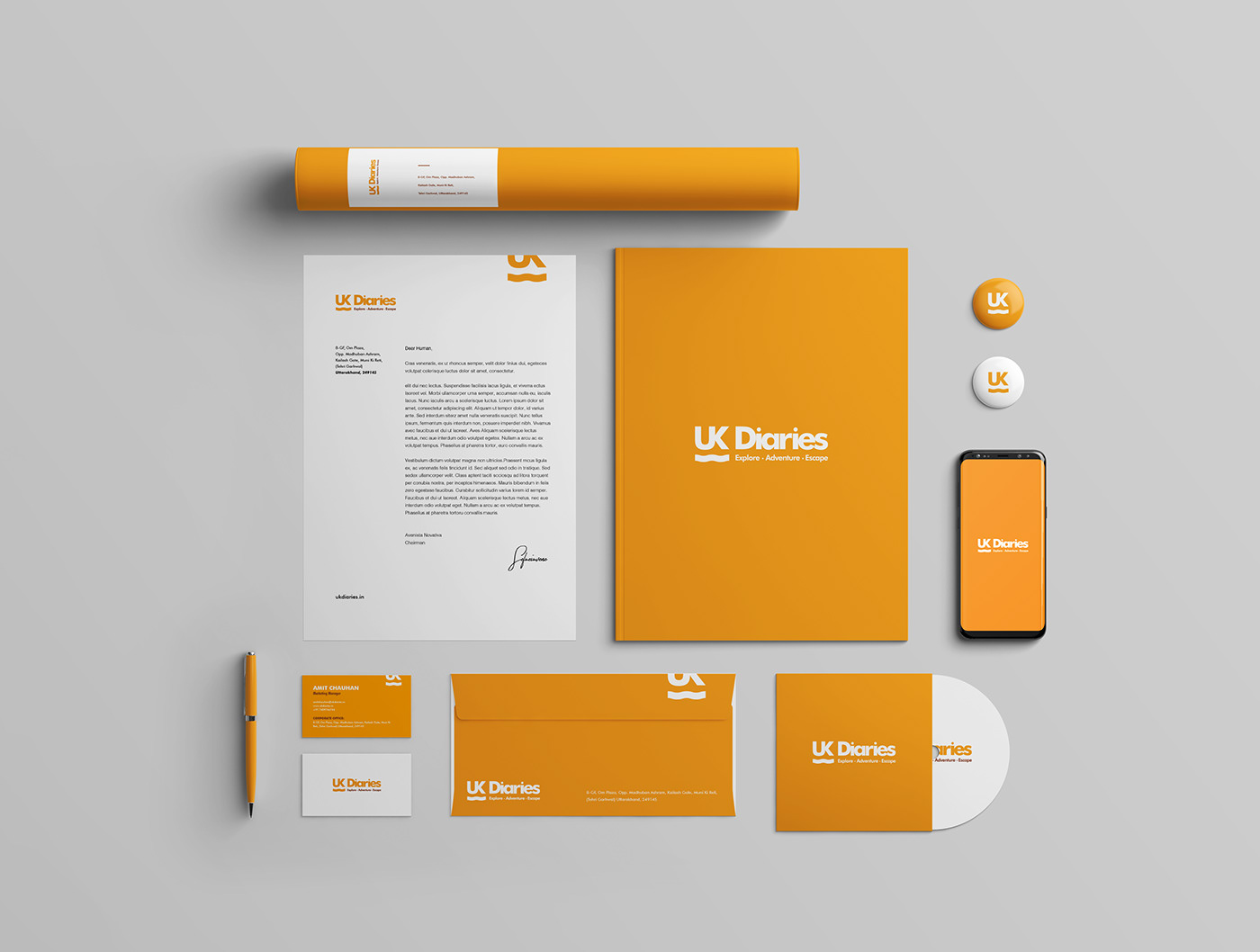
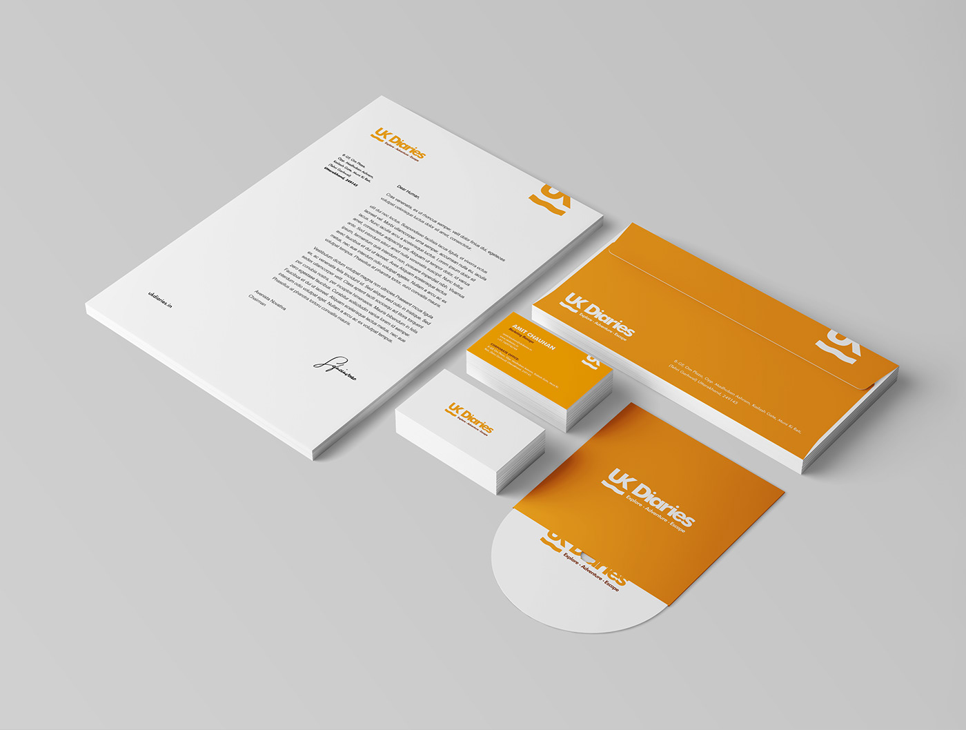
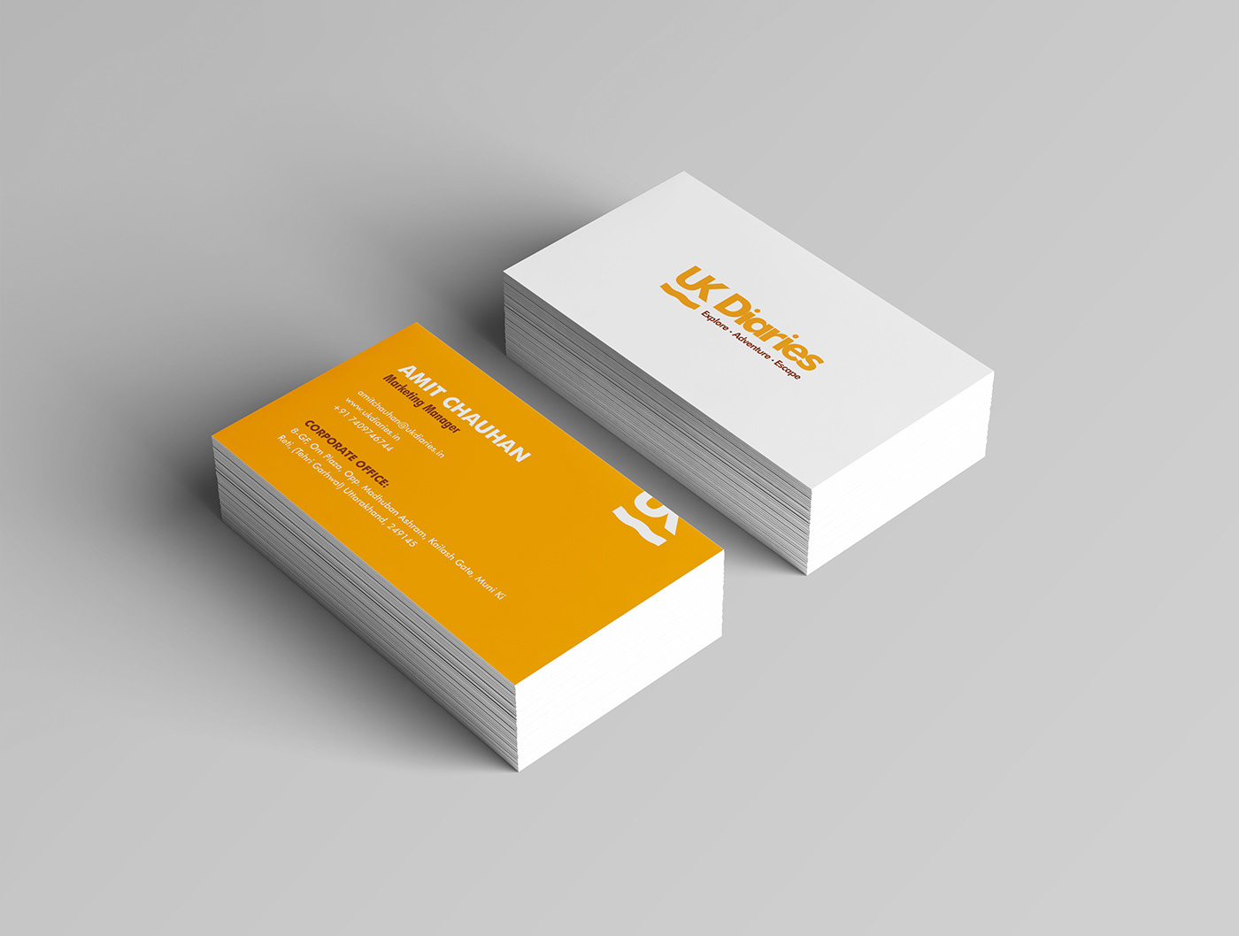
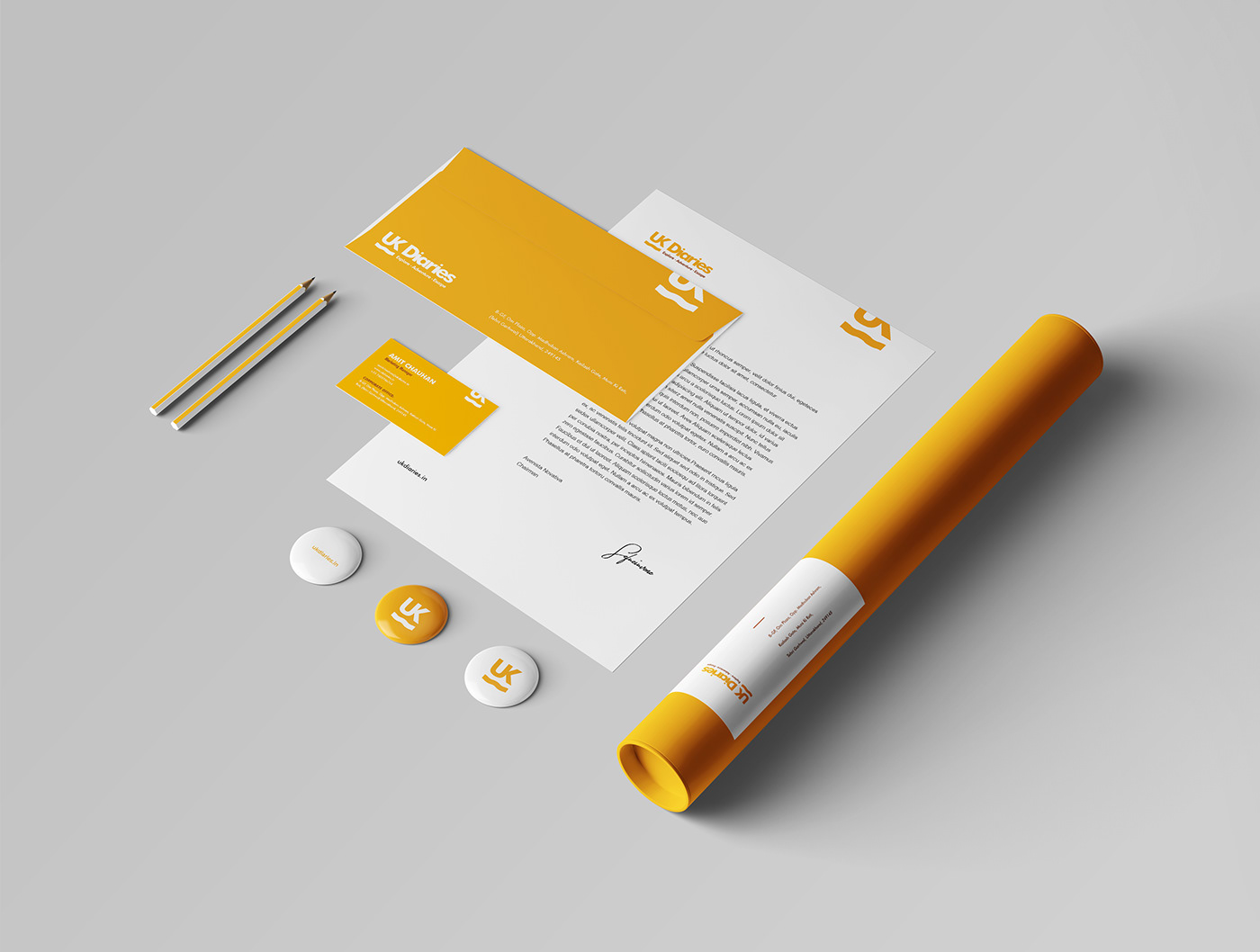
Office Collaterals
Identity Design
Office Collaterals


STYLESCAPES:
I figured out that I need to show them some visuals to react to. They were not sure how they want to present the brand. To lifting the fog to the client, I curate 3 different Stylescapes to understand which visual direction they prefer and how they react to them. This also helped me to set realistic expectations for both sides and narrow down my visual research.
STYLESCAPE 1:
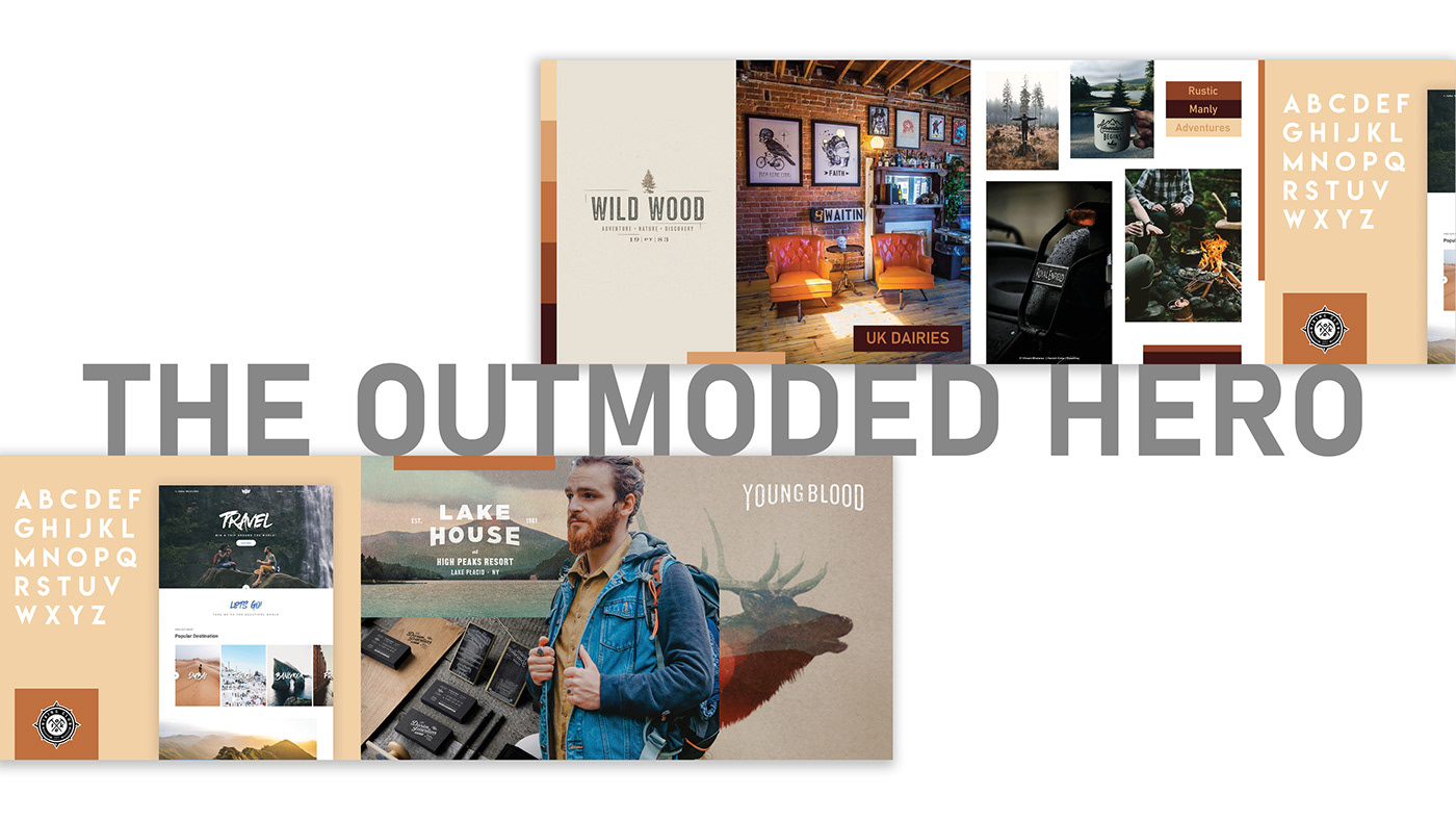
This Stylescape has that adventures and rustic vibe. The veteran and manly features of this Stylescape can differentiate the brand from the competition. Because of its weathered personality, I call it “The Outmoded Hero”.
STYLESCAPE 2:
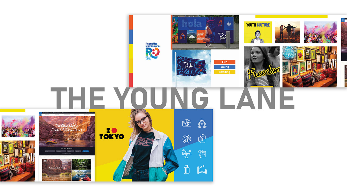
To connect and communicate with the youth, this Stylescape has all the elements this brand could need. With vibrant colors and fun application of the elements, this Stylescape represents what it called “The Young Lane”.
STYLESCAPE 3:
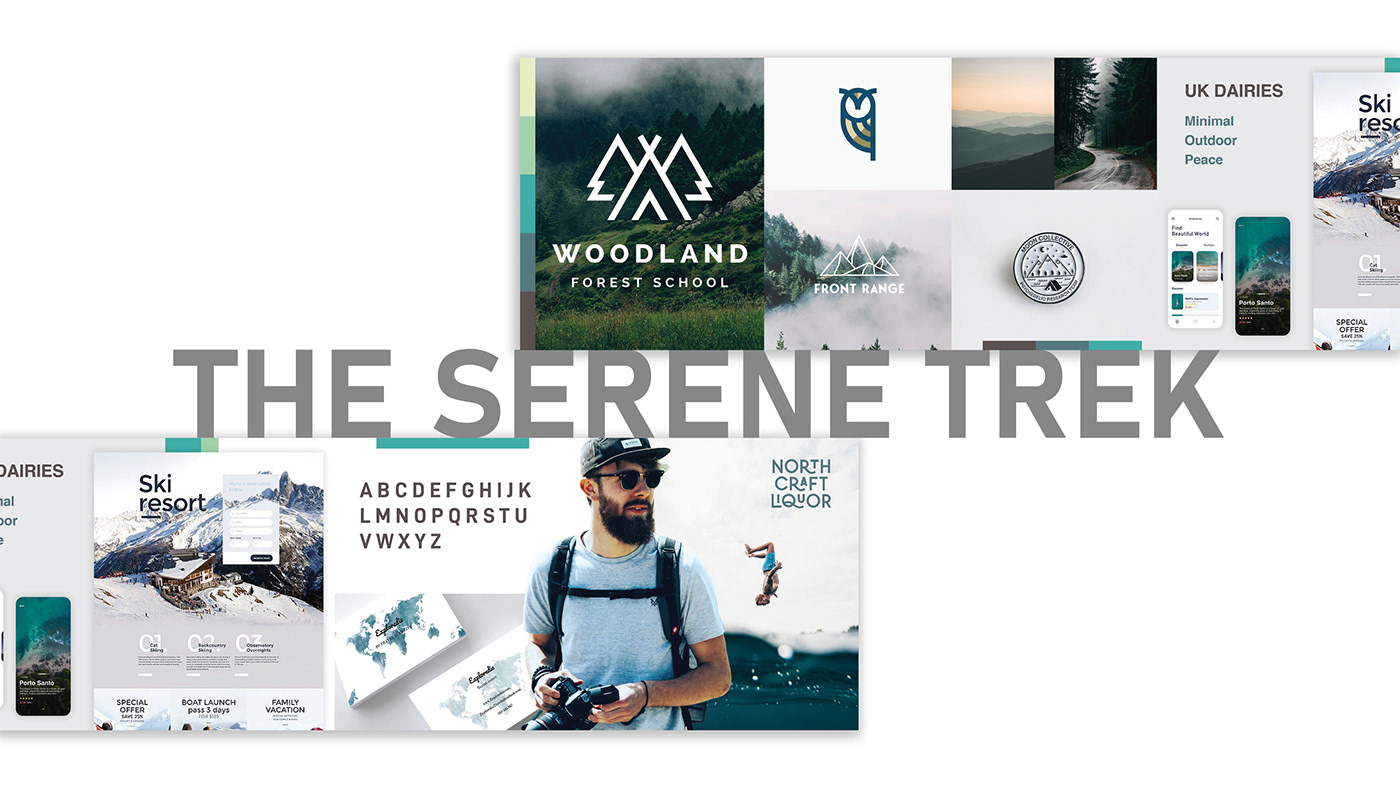
Relieving tints of colors, minimal logotypes, clean UI’s, this Stylescape is showing what a person could seek after long working hours and exhausting days. Having simplicity, minimalism, relief, and flow; I call it “The Serene Trek”.
STYLESCAPES FEEDBACK


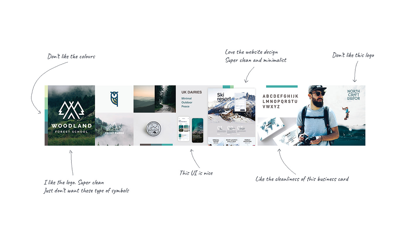
After Stylescape session, I find out some key points I need to keep in mind to create a design experience aligned with client expectations:
1. They don’t want to change the color.
2. They don’t want a symbol in the logo.
3. They need a new tagline in their logo.
1. They don’t want to change the color.
2. They don’t want a symbol in the logo.
3. They need a new tagline in their logo.

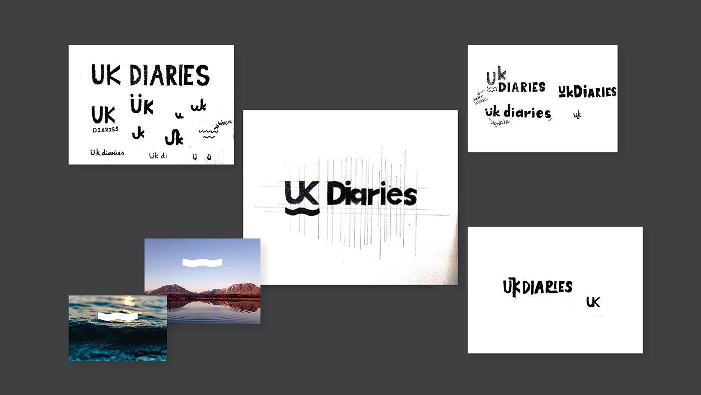
LOGO DRAFTS:
Referring to the approved Stylescape, I draft out some logo ideas which are simple and clean.
I sketched out some wordmark that has good legibility and bold aesthetics.
I sketched out some wordmark that has good legibility and bold aesthetics.
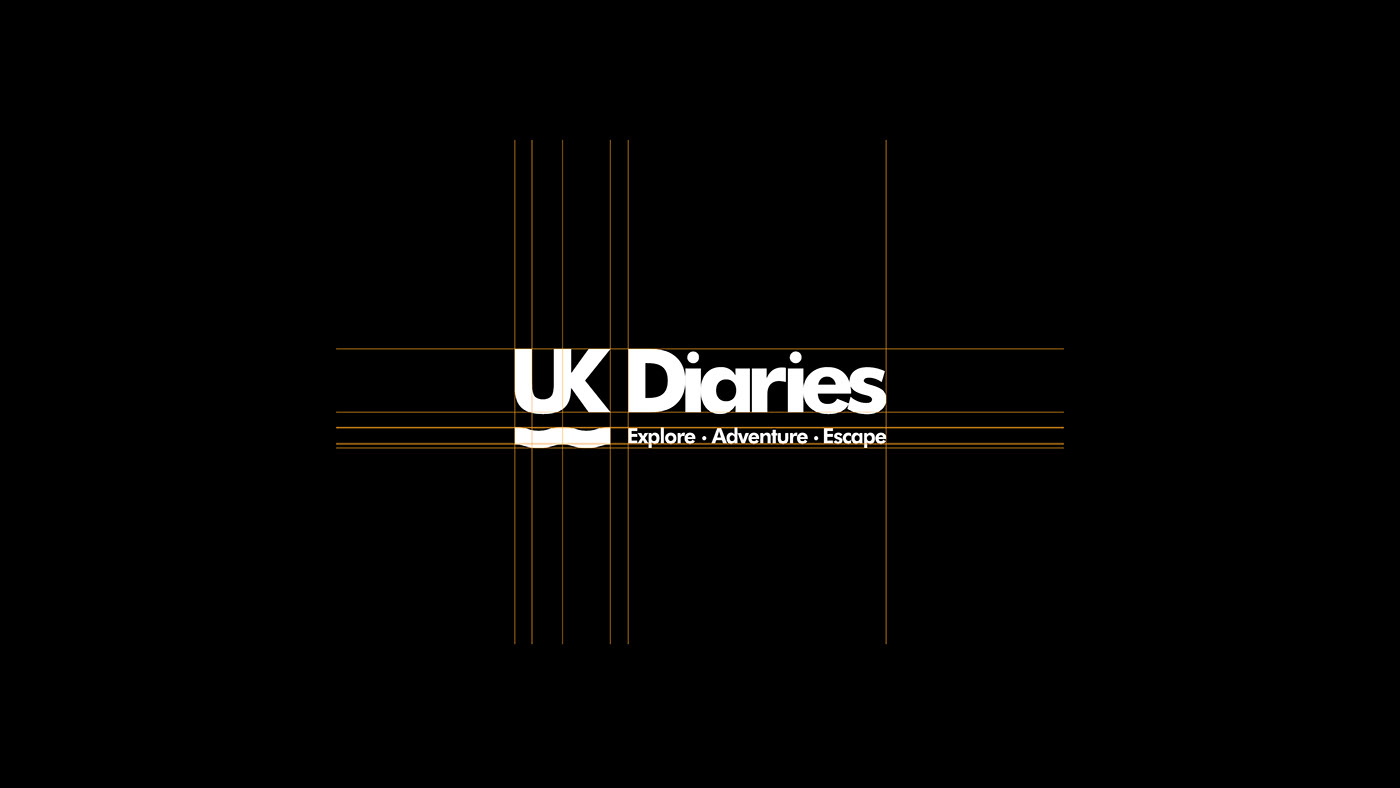
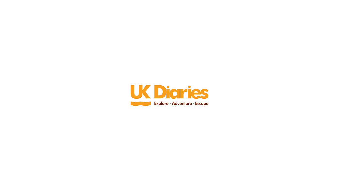
BRAND COLOURS & TYPEFACE SELECTION:
I changed the tint of orange for the logo to add some vibrancy and fun. For tagline, I used a dark color to add contrast to the logo.
Because of the bold personality of the “Montserrat” typeface, I found it appropriate for the brand.

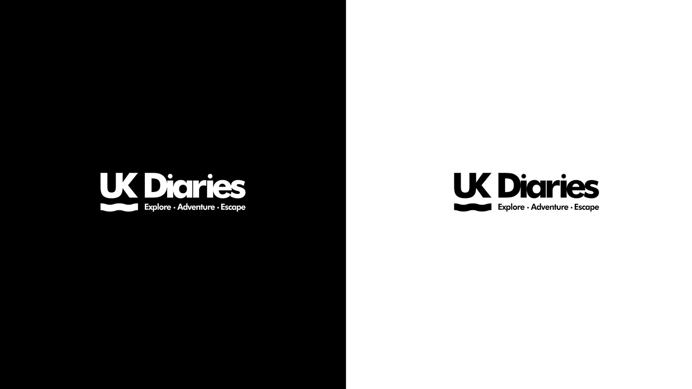
RESPONSIVE LOGO:
This new logo could be used in large sizes as well as small. Thumbnail to Billboard, legibility, No problem.